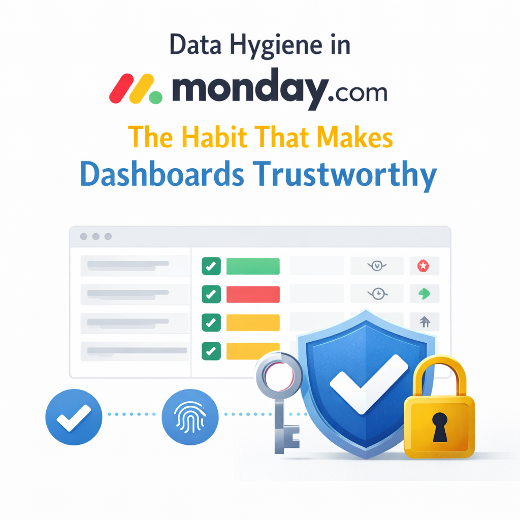


Most “bad dashboards” aren’t design issues. They’re data issues. monday.com dashboards pull information from connected boards and centralize it. If that information is inconsistent or incomplete, no amount of widget tweaking will save you.
We’ll unpack why data hygiene is the secret to dashboard reliability and how clean inputs build confidence at every level.
You open a dashboard. The numbers feel off. Sales questions the pipeline. Ops questions capacity. Leaders wonder if they can trust what they see.
Dashboards only display the data that lives on your boards. When statuses drift, dates get stale, or owners skip fields, the dashboard faithfully reflects that mess. Data hygiene keeps dashboards honest by ensuring what you feed them is complete, consistent, and current.
Data hygiene isn’t perfection. It’s consistency.
Clear ownership. Each column serves one purpose. Each status label means what everyone agrees it means. monday.com’s status column is designed to help you plan, organize, and track work using defined labels. Customizing and documenting these labels keeps your team aligned.
Structured inputs. Statuses aren’t free‑form notes. Use dropdowns and statuses with clear labels. Add descriptions so everyone knows what “In review” or “Blocked” means.
Required fields where it matters. If a deal can’t move forward without a value, set up validations or automations that enforce those fields. Monday.com’s data validation rules help you specify criteria for columns so that data can only be entered when conditions are met.
Automation guardrails. Automations in monday.com use simple “if‑this, then‑that” logic to move items, assign tasks, and notify stakeholders. They remove manual entry, reduce errors, and ensure nothing falls through the cracks.
Regular cleanup habits. Archiving old items or boards keeps your workspace tidy and doesn’t delete your history. Monday lets you archive boards, items, groups, or workdocs and restore them anytime. Set an automation to archive completed tasks automatically.
When these habits are in place, dashboards stop feeling fragile. They become reliable snapshots of what’s happening.
Bad data doesn’t scream. It whispers. A status label lingers in “In progress.” Due dates slip without updates. People skip fields because “they’ll fill them in later.” Small gaps add up until reports no longer reflect reality.
When leadership stops trusting dashboards, they turn to exported spreadsheets and side conversations. The tool isn’t at fault; the process is. Clean data turns dashboards into leadership tools instead of pretty charts.
Telling teams to “be better about data” never works. At OrangeDot, we design systems where good data hygiene happens by default.
When the system enforces the rules, your team doesn’t have to memorize them. Dashboards become sources of truth leaders can trust.
These small habits compound quickly.
Why do dashboards look wrong even when the setup is correct?
Dashboards reflect the data underneath. If statuses, dates, or owners are inconsistent, the dashboard shows that inconsistency. Clean up the inputs before blaming the dashboard.
How often should we review data hygiene?
Quarterly is a good baseline. High‑growth teams often review monthly, especially for sales and operations.
Can automations really improve data hygiene?
Yes. Automations remove manual decisions and enforce rules consistently. monday.com’s automations let you define simple triggers and actions—no coding required.
Should we clean data before or after building dashboards?
Always before. A dashboard is a reward for clean data, not a diagnostic tool.
Data hygiene in monday.com isn’t glamorous. But it’s the habit that turns dashboards from something you glance at into something you depend on.
Clean data leads to reliable dashboards. Reliable dashboards lead to confident leaders. When reports feel fragile, the fix isn’t another widget—it’s a better system.
📢 Need help implementing this in monday.com?
Talk to a certified monday.com expert → Contact Us