

Executives love dashboards, but most monday.com reporting never makes it into their weekly conversations.
Too many teams build dashboards that look pretty but don’t help anyone make an actual decision. The good news is that monday dashboards can be incredibly powerful when they’re designed around the right KPIs, not just colorful widgets.
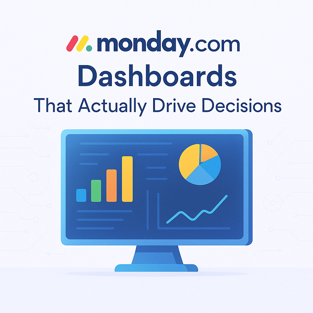
This guide breaks down what leaders really want to see and how you can build dashboards in monday.com that drive clarity, alignment, and action.
Most teams build dashboards the same way they build their first board.
They add everything.
Every metric. Every widget. Every chart. Every status.
The result is a dashboard that’s visually dense and cognitively useless.
Leaders don’t want fireworks. They want filters that matter. They want fast clarity. They want answers to the questions they ask every week. And that only happens when monday.com reporting is built around decisions, not data decorations.
Executives Look For Three Things
These are the universal categories leaders care about inside monday dashboards.
KPI Performance
They want to know if the business is on track.
Think revenue, spend, efficiency ratios, capacity, cycle times, backlog burn.
Project Velocity
Not project status. Velocity.
How fast things are moving. What’s blocked. What’s slipping. Where teams need support.
Pipeline Health
Whether deals, requests, or initiatives are progressing.
Where momentum exists. Where attention is needed.
If a widget doesn’t support one of these three themes, it probably doesn’t belong on an executive dashboard.
Ask what decision the dashboard needs to support, then reverse engineer it.
Great dashboards don’t need fifteen connected boards.
They need clean source boards with clear ownership.
Some widgets consistently outperform others.
Leaders don’t want every task.
They want what’s behind, what’s at risk, and what’s driving outcomes.
Widgets with independent filters make monday dashboards far more strategic.
One dashboard. One purpose.
Trying to mix sales, ops, and delivery metrics in a single view creates a blurry story.
Create separate dashboards such as:
Then link them together in a simple top level “Leadership Overview” dashboard.
We build dashboards that help companies run the week, not decorate it.
Our monday dashboard approach focuses on:
If a widget doesn’t answer a business question, it’s removed.
We help teams define KPIs, build the underlying boards, and create formulas or rollups that make the data actually useful.
Every dashboard is tied to a weekly meeting or leadership decision.
Dashboards only work when the underlying boards are built intentionally.
We fix the system first, then build reporting on top of it.
If you want dashboards that fuel decisions instead of confusion, that’s exactly what we help teams build every day.
Small details dramatically improve monday.com reporting accuracy and adoption.
What’s the difference between a monday board and a dashboard?
Boards store the data. Dashboards visualize it. Strong dashboards require strong board architecture first.
How many widgets is too many?
If a leader can’t understand the dashboard within ten seconds, it’s too many. Simplicity increases clarity.
How do I build dashboards for multiple teams?
Give each team its own functional dashboard. Use a single top level dashboard for leadership.
Can monday dashboards be used for forecasting?
Yes. With formula columns, custom KPIs, and rolling date filters, monday dashboards can forecast revenue, velocity, capacity, or workload.
Dashboards should make your business easier to run.
When your monday.com reporting is clean, intentional, and tied to real decisions, leaders finally get the clarity they need and teams start operating with more alignment.
If you want dashboards that actually move your business forward, it all starts with the right architecture in monday.
Need help implementing this in monday.com?
Talk to a certified monday.com expert → Contact Us